)
)
)
)
)
)
)
Cynthia Frownfelter-Lohrke

PREPARING FINANCIAL GRAPHICS
Principles to make your presentations more effective
In Brief
All You Need Is a Spreadsheet
Graphics are especially helpful for the preparation and interpretation of summary financial data. Prepared properly, they serve to highlight trends and focus the reader on important information. While some graphics-specific software packages exist, any spreadsheet package will enable a firm to produce cost-effective graphics.
The Canadian Institute of Chartered Accountants has constructed the following basic guidelines for preparation of financial graphics:
* Choose a graph type,
* Prepare the graph, and
* Make sure the graph is not deceptive.
The authors have prepared several examples of poor graphics that have been redone to more effectively communicate the data.
Do you like the look of fancy financial presentations but think they are just for Fortune 500 reports? How can you utilize the software and talent you already have to create impressive visuals for that next monthly write-up, board meeting, or client presentation? Are you wondering where to begin? If any of these questions spark your interest, we have the answers.
Why Use Graphics
Many studies, from ad hoc to academic, have surveyed the use of graphics in communicating information. As early as the 1920s, authors began analyzing graphics and their usefulness in summarizing scientific data. More recently, graphic researchers have begun measuring graph discrepancy (to assess the magnitude of potentially misleading graphs) and the impact of pictures and graphs on decision making.
Graphics are especially helpful for the preparation and interpretation of summary financial data. CPAs typically prepare financial statements in accordance with GAAP using formats and terminology commonly known only to those with business and financial training. Graphics may serve to break through the barriers created by jargon and rigid financial statement formats, enabling more effective communication between CPAs and non-CPAs.
No matter who the user is, graphics are useful for summarizing key financial (e.g., sales, net income) and nonfinancial (e.g., employee turnover, numbers of accidents) information. Prepared properly, graphics highlight trends and focus on what the preparer wants the reader to learn from the financials. Sloppy graphics, however, may further confuse a user already inundated with information.
Graph Software
While public companies and large accounting firms are likely to rely on specialized expertise in preparing publication-quality graphics for the annual report, many CPAs are likely to utilize in-house computer and staff resources to prepare presentations and write-ups.
Today's accounting software is as varied as the businesses it serves. Nevertheless, many general ledger and several write-up packages maintain graphics capabilities. For example, QuickBooks, Peachtree, Computer Solutions, and CPA Analyst include graphing under most report options.
While some graphics-specific software packages exist (e.g., Freelance Graphics and Harvard Graphics), most CPA firms and many accounting departments may only have access to a basic spreadsheet package--e.g., Lotus, Excel, or Quattro Pro. Since spreadsheet packages tend to be "data friendly," that is, they allow for relatively easy import and export of data, almost any firm or department can prepare cost-effective graphics without purchasing additional software.
An advanced user of a spreadsheet package will probably already know something about graphics. Those that do not should plan to spend a few hours with a detailed user's manual or enroll in an advanced course for spreadsheet users that addresses graphics. Key skills include importing and exporting data files and creating alternative forms of graphics. In a few hours' time, a typical user can become familiar enough with techniques to create basic, yet effective, visual output.
Basic Guidelines for
Financial Graphics
Software know-how is just the beginning. While graphics have received relatively little attention from CPAs in the United States, Canada's accounting profession has invested in studying the use of graphs. In its 1993 study, the Canadian Institute of Chartered Accountants produced some basic guidelines for financial graphics.
Choose a Graph Type. The five most common types of graphs are the bar or column graph, the line graph, the combination bar-line graph, the stacked bar graph, and the pie graph. Line and bar graphs are based upon Cartesian coordinate axes and normally include two scales (e.g., the xaxis is years, while the yaxis is dollars). Bar graphs depict the data in a horizontal format, whereas column graphs are vertical. Line and bar graphs are considered useful for time series data (e.g., sales or profit trends). The segmented bar graph can be used to show percentages and proportions as well as time series relationships. The pie graph is adept at conveying percentages and proportions, but is best used for a single time period, as opposed to a time series.
Prepare the Graph. Once the data is input, there will be choices to make and options to select. Some of these include the scaling, colors, and titles to be included in the final graph. The graphics guidelines shown in Exhibit 1 will assist in these selections.
Make Sure the Graph Is Not Deceptive. The graph discrepancy index (GDI) is an important tool for determining whether or not the scales of a bar or line graph accurately depict the underlying data. The GDI provides a statistical summary measure comparing the actual differences in the data versus the measurement differences (distances) depicted in the graph of that data. The GDI is calculated as follows: (A/B)1, where A is the size of the effect shown in the graph, and B is the size of the effect in the data. A graph with scales or sections consistent with the underlying data corresponds to a GDI of zero. Indices above zero indicate an exaggeration of the data, whereas indices below zero indicate a "smoothing" or leveling of the data.
Exhibit 2 shows an example of this type of discrepancy that can be caused by either a scale that is not appropriate for the graph or one that has been cut off (i.e., does not start at zero). In the first graph, although sales for 1998 are 20% higher than sales for 1997, the physical difference between the two columns is 200%, therefore GDI=(200/20)1, or nine. In this case, the graph exhibits 900% distortion. Obviously, this is due to the scale beginning at $90,000 instead of zero. This was the graph that Excel prepared by default. In the second graph the scale has been changed to begin at zero, therefore where there is a 20% change in the net income, there is also a 20% change between the height of the first and second column. It has been suggested that material distortion is evident when the absolute value of the GDI is greater than .05.
Graphic Makeovers: Before and After
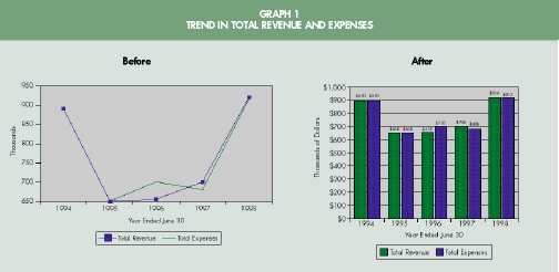
To illustrate the application of guidelines for good graphics, we put them to work in the "makeovers" of graphs provided by a local CPA firm in San Antonio, Texas. Each of the "before" graphs is based upon a graph used in a client presentation. The "after" graphs are improved versions of the originals, after applying the guidelines for good graphics shown in Exhibit 1.
Graph 1: Trend in Total Revenue and Expenses. The purpose of this graph is to provide the user with an overall impression of the trends in revenue, expense, and net income. The original line graph is complicated by the overlapping of data points, coupled with the absence of adequately defined and labeled scales and gridlines.
There are several potential areas for improvement. First, the scale of the graph does not begin with zero, resulting in a GDI of .083, or 8.3%. Furthermore, data points are not clearly defined on the graph.
To enhance readability, the line graph was recast as a column graph. Because the data in each series are within a close range, the column graph better depicts the two. In addition, the scales were recast to begin with zero. This change lowers the GDI to near zero. The axis was formatted to display dollars, the variable of interest. Gridlines were added to allow the eye to easily assess the differences in scale, and the colors were changed to aid distinction from one another.
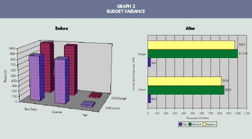
Graph 2: Budget Variance. This three-dimensional column graph displays the variance between actual and budgeted revenues and expenses for the year 1998. Without "favorable" or "unfavorable" variance labels or the underlying data for revenues and expenses, the reader is left to wonder whether the differences between revenues and expenses led to better or worse than expected results. Finally, the scale is too wide relative to the total graph, and the GDI measures .51.
The three-dimensional graph was recast to avoid optical confusion. In addition, the graph was reconstructed to incorporate the data necessary for the reader to interpret the favorable or unfavorable nature of the budget variance. The graph was improved through the use of a narrow scale, along with labeled data points and units of measure (dollars). The colors were altered to allow for more contrast.
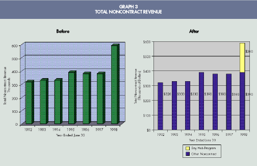
Graph 3: Total Noncontract Revenue. This graph conveys a basic trend in total noncontract revenue. The graph is basically sound except for two features: dimension and labeling. First, the graph is three-dimensional, which is not recommended. Second, data points are not marked, and a key component of noncontract revenue is not identified.
The revised graph captures information within the data. By highlighting the new source of revenue, realized for the first time in 1998, the reader not only sees that noncontract revenue has increased, but that the Day Habitation Program is the source of the increase. The data points are now labeled, and the axis is formatted to display units in dollars. In this improved graphic, the trend information is clearly depicted and the reader is focused on the new program.
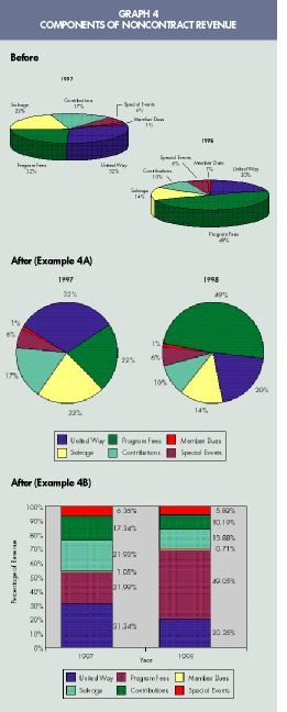
Graph 4: Components of Noncontract Revenue. As a follow-up to Graph 3, Graph 4 details the remaining components of noncontract revenue. The original pie chart is three-dimensional, which creates unnecessary distraction for the reader. The colors are vivid, yet not always easily distinguished from adjacent colors.
This pie chart is in need of a new recipe, including new colors, a legend, and a systematic layout. First, the pie chart was recast in one dimension (Example 4A). Next, a legend was created in the open space around the graph. The pie chart was rotated so that the slices read from left to right, largest to smallest. Colors were carefully chosen to contrast with those adjacent. Finally, slices of the pie were placed next to one another in decreasing order of size to allow for ease of comparison.
A better way to show this data would be with a segmented column chart as shown in Example 4B. This type of graph is easier to construct than multiple pie charts because pie slices tend to be difficult to compare and may not be in the same order. The segmented column chart makes it easier to compare component parts.
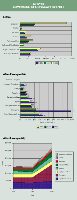
Graph 5: Comparison of Nonsalary Expenses. The purpose of this graph is to depict trends in nonsalary expenses, as well as their composition, over time. The graph is heavy with data, but relatively difficult to read. In addition, some discrepancy is evident, and the GDI measures .105.
The new chart shown in Example 5A allows for multiple comparisons. First, it is easy to ascertain which categories consume the greatest resources, e.g., occupancy and payroll taxes. The items were rearranged in ascending order of amount spent so that comparisons can be made between years and items. Second, the reader can see trends for individual items and notice, for example, the spike in occupancy expenses in 1998.
If the focus is on the trend in total expenses, rather than the trend in individual expenses, another form of graph may be preferable. This graph was also recast as an area graph, as shown in Example 5B. While individual expenses are still broken out (albeit without the benefit of specific dollar labels, which would clutter the graph), the overall trend is more easily discernible. When using both graphs in conjunction, users receive a more complete picture of the trend in expenses. *
Cheryl Linthicum Fulkerson, PhD, CMA, CPA, is an assistant professor, and Marshall K. Pitman, PhD, CMA, CPA, an associate professor, at the University of Texas at San Antonio. Cynthia Frownfelter-Lohrke, PhD, CPA, is an assistant professor at the University of South Florida, Tampa.
By Cheryl Linthicum Fulkerson, Marshall K. Pitman, and
Cynthia Frownfelter-Lohrke
The CPA Journal is broadly recognized as an outstanding, technical-refereed publication aimed at public practitioners, management, educators, and other accounting professionals. It is edited by CPAs for CPAs. Our goal is to provide CPAs and other accounting professionals with the information and news to enable them to be successful accountants, managers, and executives in today's practice environments.
©2009 The New York State Society of CPAs. Legal Notices
Visit the new cpajournal.com.